


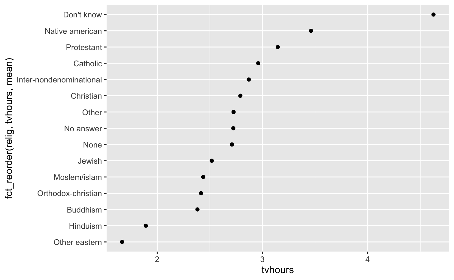
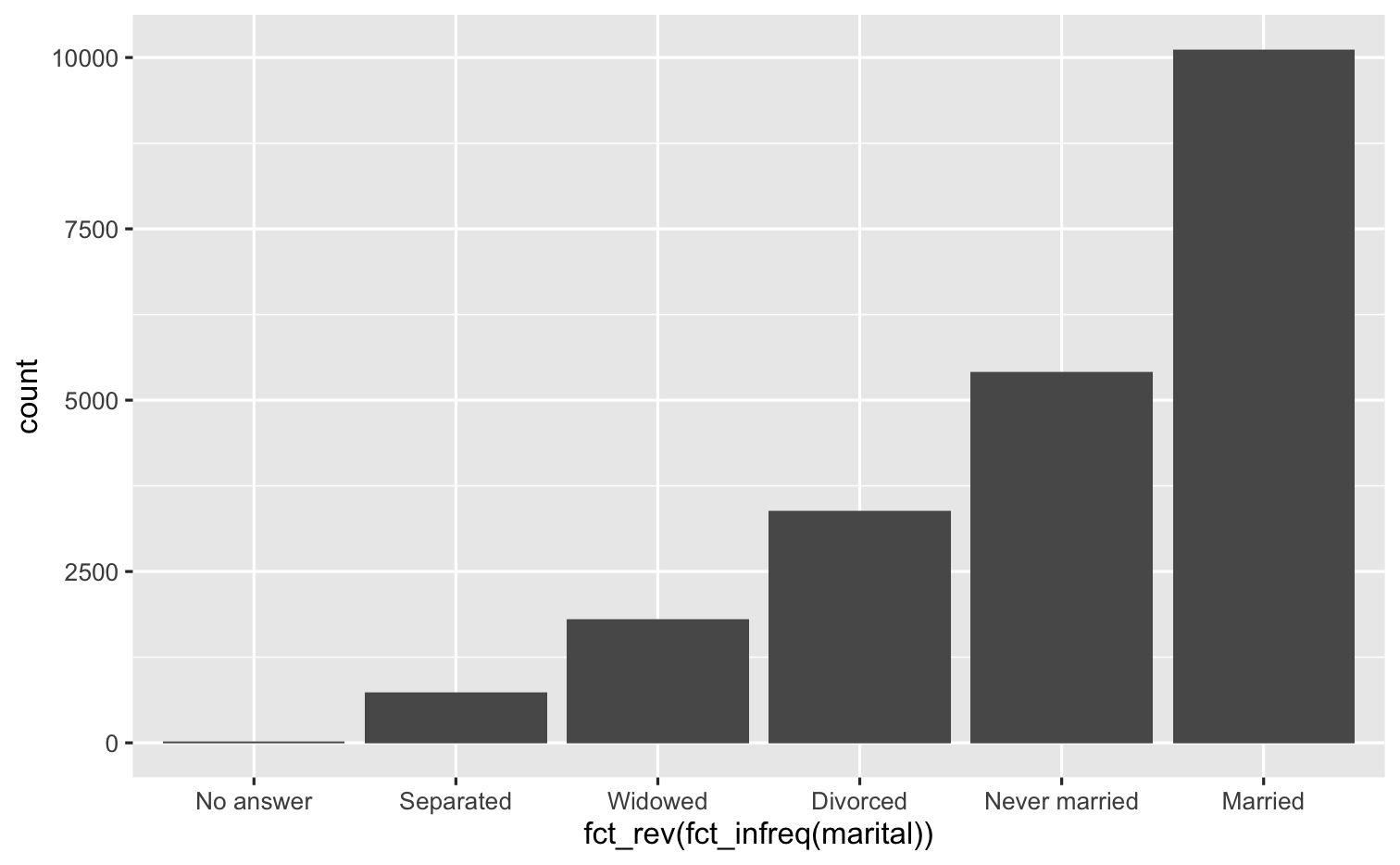
Which plot do you prefer?
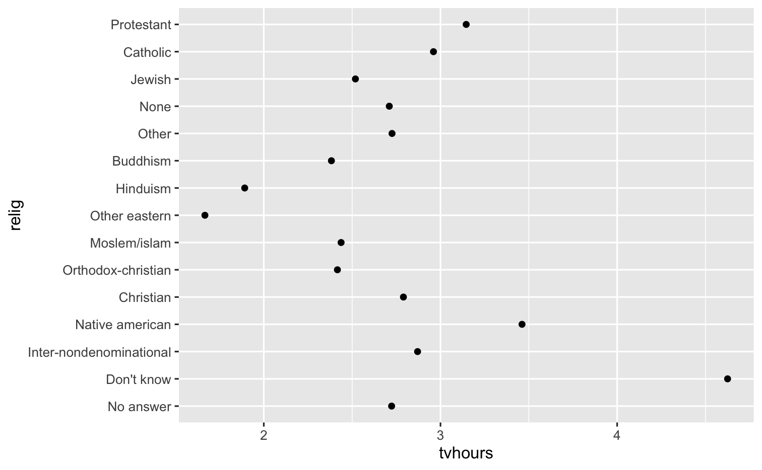
levels(gss_cat$relig)#> [1] "No answer" "Don't know" "Inter-nondenominational"#> [4] "Native american" "Christian" "Orthodox-christian" #> [7] "Moslem/islam" "Other eastern" "Hinduism" #> [10] "Buddhism" "Other" "None" #> [13] "Jewish" "Catholic" "Protestant" #> [16] "Not applicable"
Reordering levels
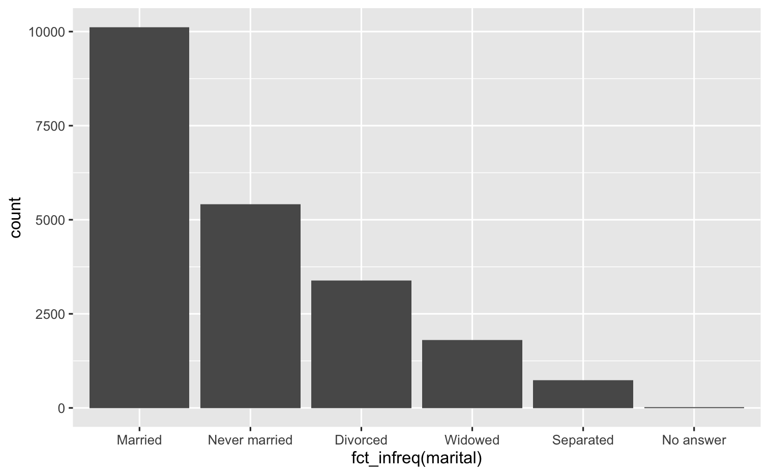
fct_infreq()
ggplot(gss_cat, mapping = aes(x = fct_infreq(marital))) + geom_bar()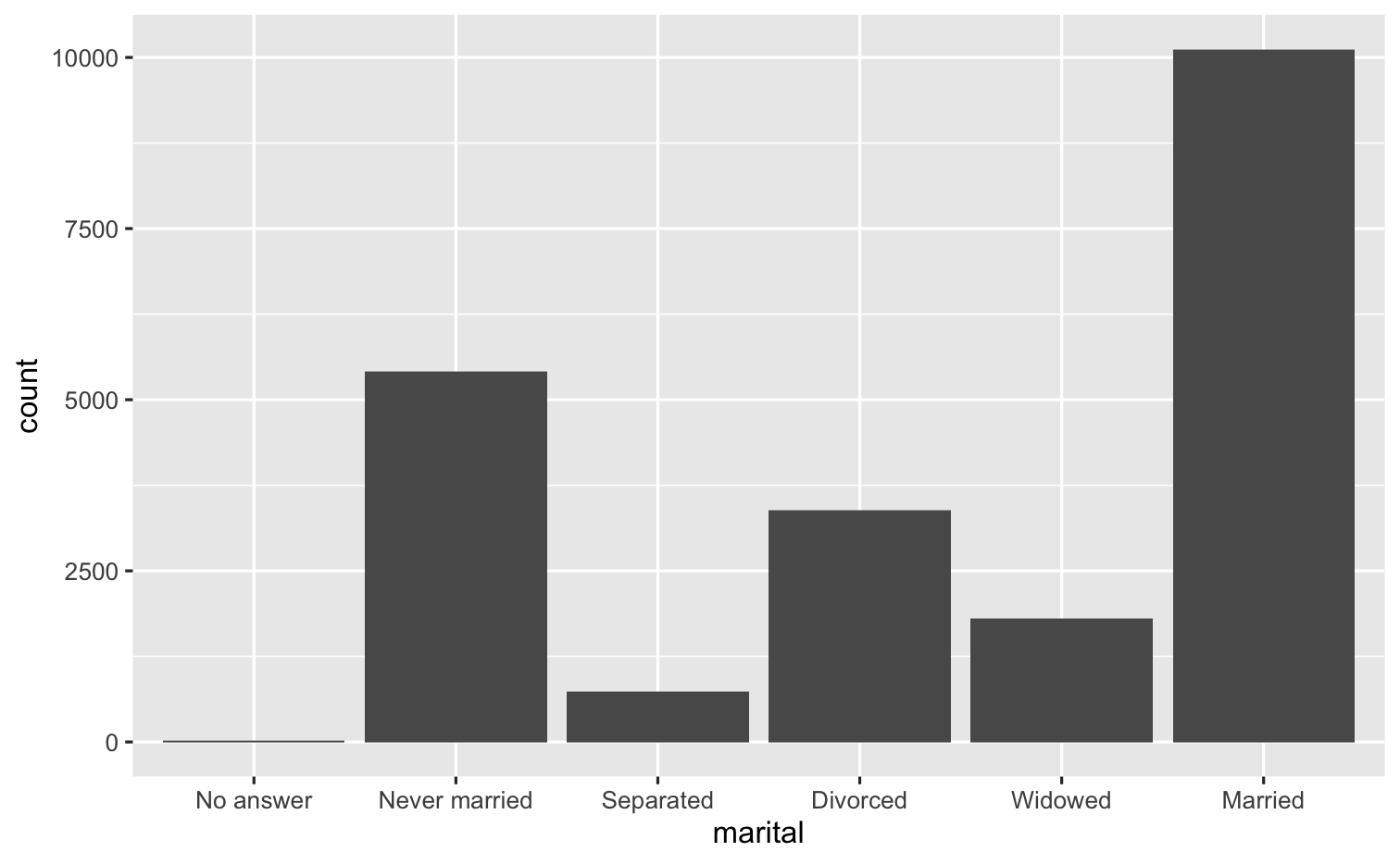
fct_rev()
ggplot(gss_cat, mapping = aes(x = fct_rev(fct_infreq(marital)))) + geom_bar()
Recoding levels
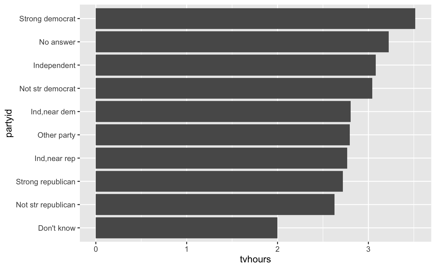
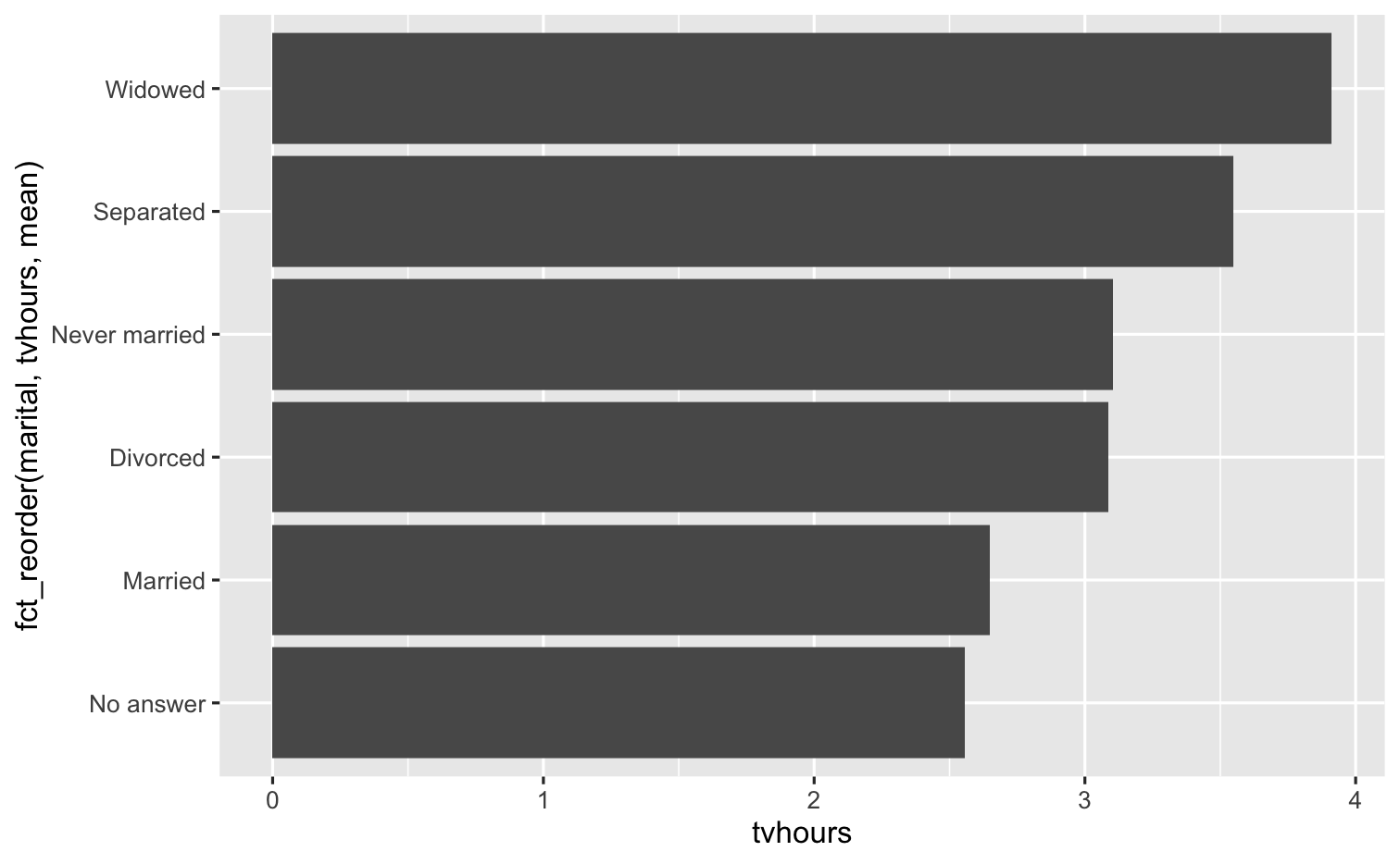
gss_cat %>% drop_na(tvhours) %>% mutate(partyid = fct_recode(partyid, "Republican, strong" = "Strong republican", "Republican, weak" = "Not str republican", "Republican, lean" = "Ind,near rep", "Democrat, lean" = "Ind,near dem", "Democrat, weak" = "Not str democrat", "Democrat, strong" = "Strong democrat")) %>% group_by(partyid) %>% summarize(tvhours = mean(tvhours)) %>% ggplot(mapping = aes(x = tvhours, y = fct_reorder(partyid, tvhours, mean))) + geom_col() + labs(y = "partyid")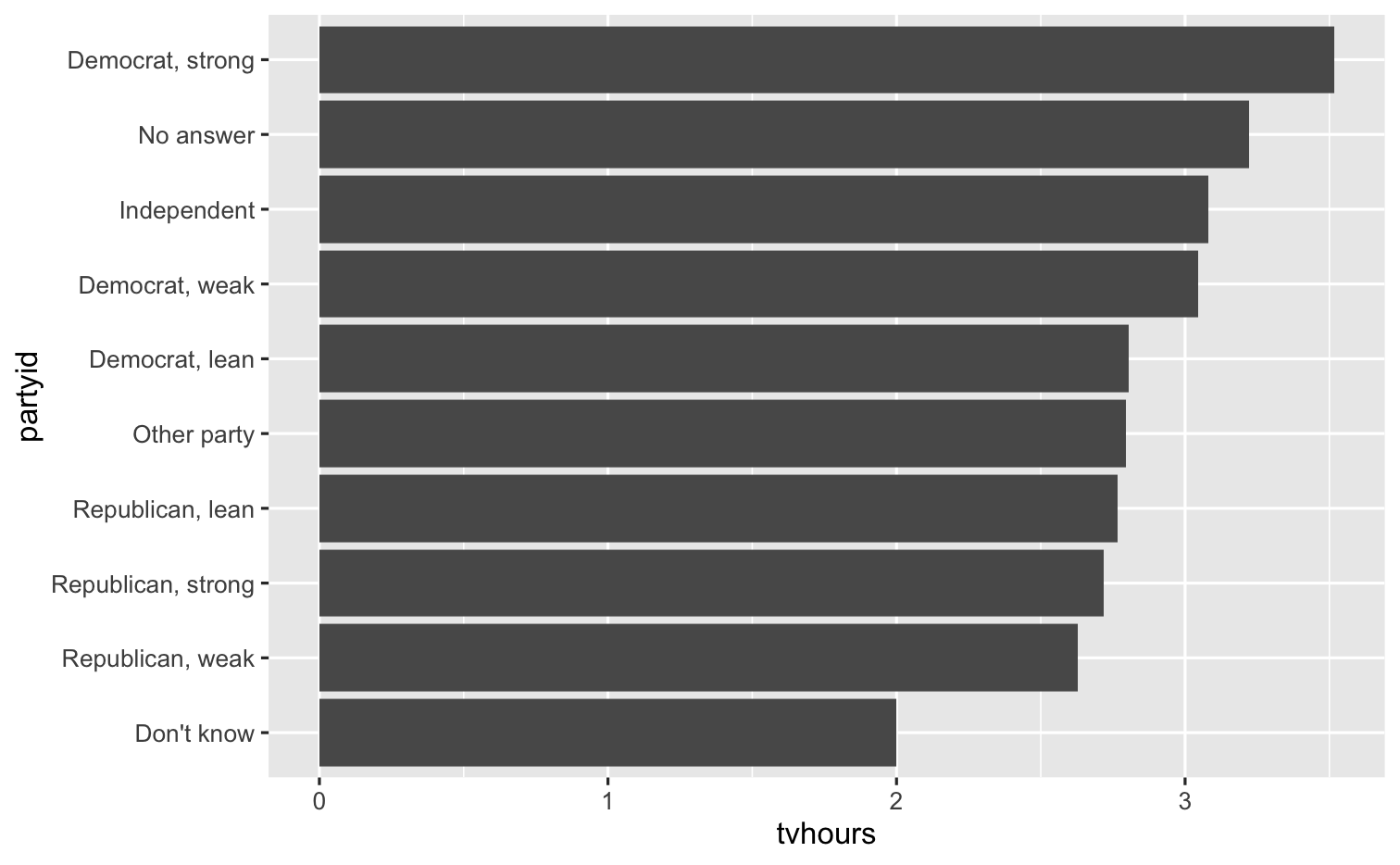
Collapsing levels
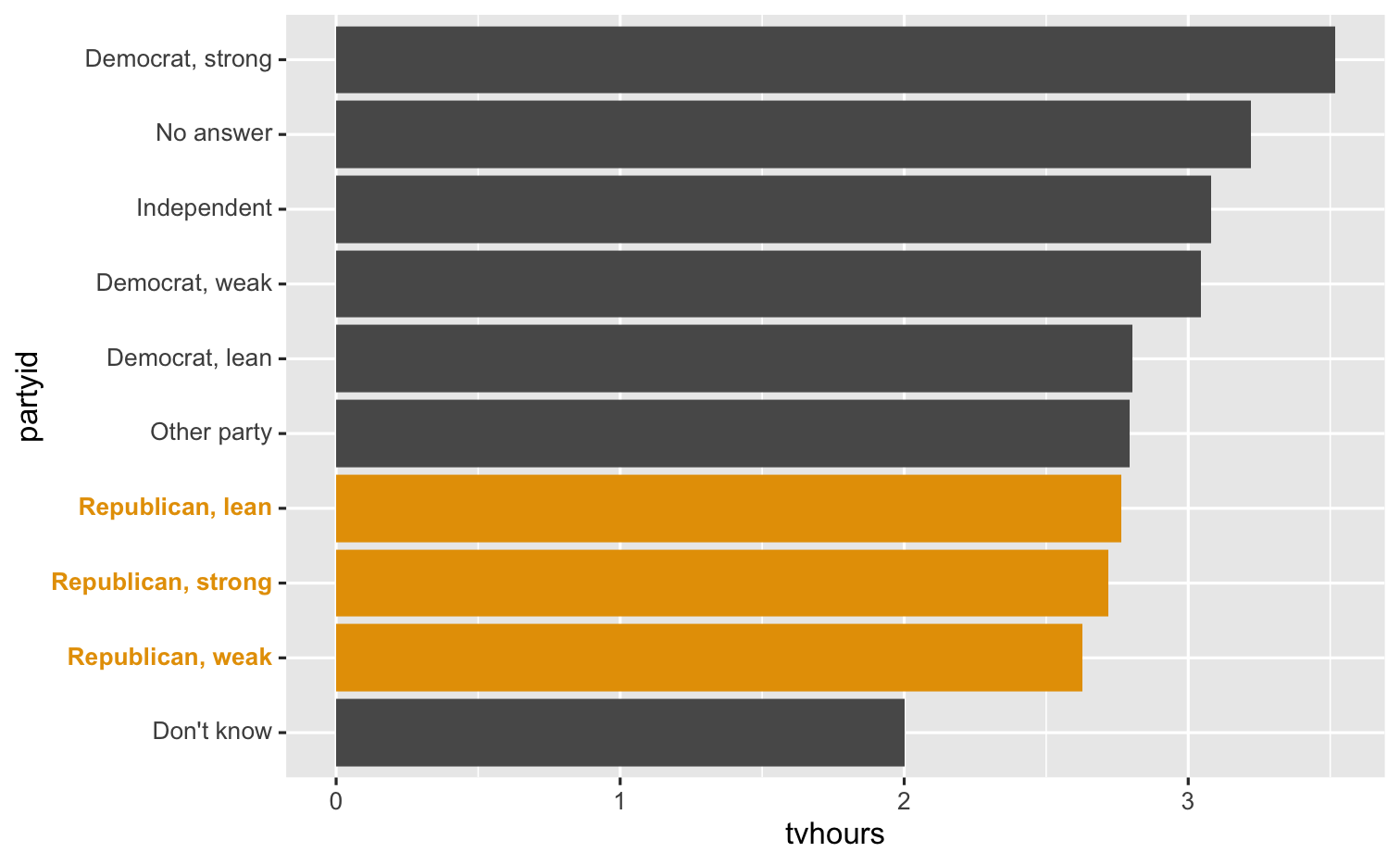
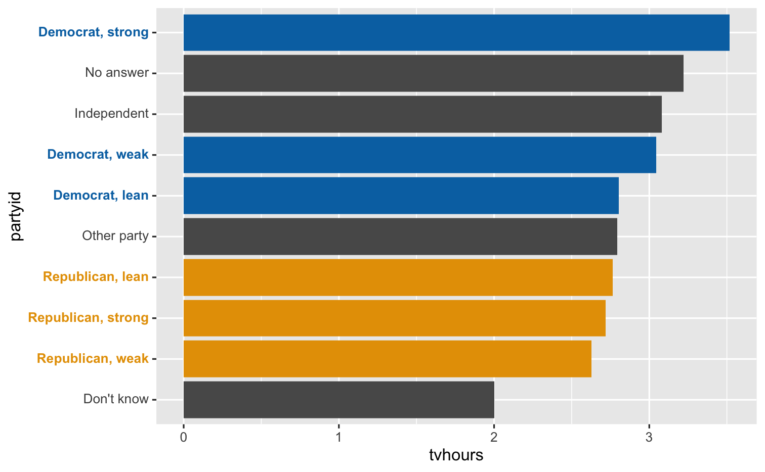
gss_cat %>% drop_na(tvhours) %>% mutate(new_party = fct_collapse(partyid, Conservative = c("Strong republican", "Not str republican", "Ind,near rep"), Liberal = c("Strong democrat", "Not str democrat", "Ind,near dem"))) %>% ggplot(mapping = aes(x = fct_infreq(new_party))) + geom_bar() + labs(x = "party")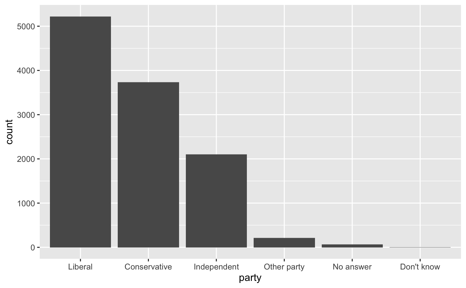
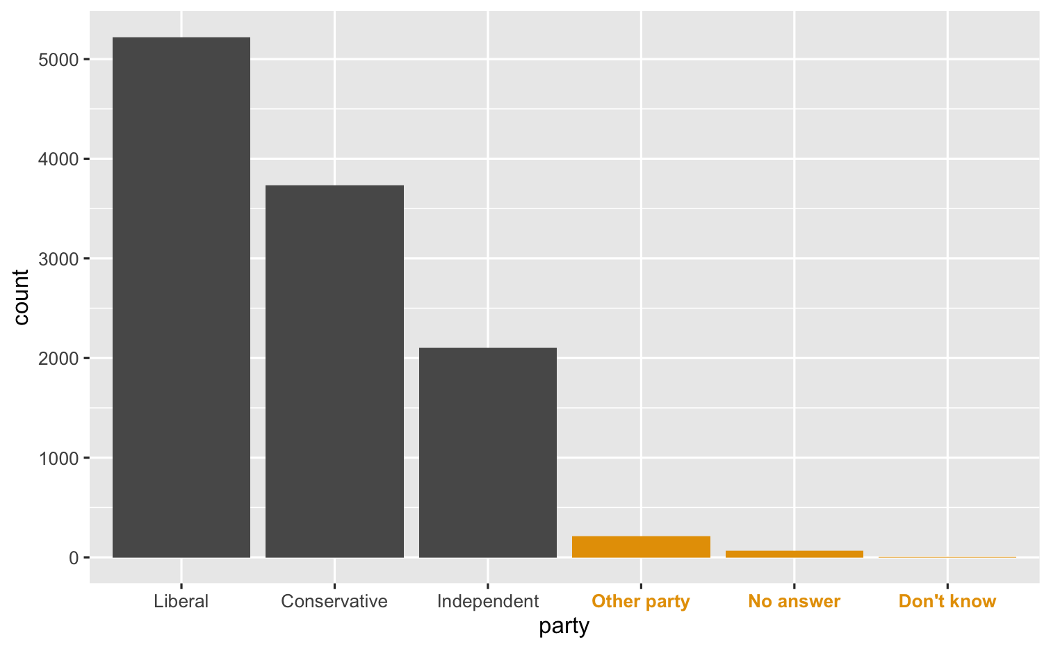
gss_cat %>% drop_na(tvhours) %>% mutate(new_party = fct_collapse(partyid, Conservative = c("Strong republican", "Not str republican", "Ind,near rep"), Liberal = c("Strong democrat", "Not str democrat", "Ind,near dem")), new_party = fct_lump_n(new_party, other_level = "Other", n = 3)) %>% group_by(new_party) %>% summarize(tvhours = mean(tvhours)) %>% ggplot(aes(x = tvhours, y = fct_reorder(new_party, tvhours, mean))) + geom_col() + labs(y = "partyid")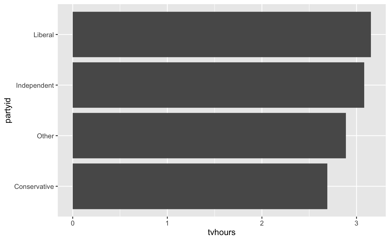
Creating dates and times


lubridate

Data Types